P4: Montage Project

LeahMcQueen-P4Montage


  • Description: Inspirational photo montage that includes two images and a quote.
  • Process: I began this project by looking for resources to use, first by finding the quote and then by looking for pictures that related to the quote. I then worked on combining the forest image and the runner image in Photoshop. I put a mask on the runner and took out most of the background of her image. After masking the image, I started trying out filters and decided I liked the effect called dissolve. I brought in more of the background in the runner’s picture to make the dissolve effect more consistent across the image such as behind the word “line.” I then added the text, making the key word “finish line” and “journey” a different font to make them stand out. Then I added the purple text box to create a triadic color scheme. Finally, I aligned the text and added drop shadows to make it more legible.
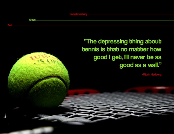
  • Message: The message is the quote from Dieter F. Uchtdorf about how in life we often forget to enjoy what is happening now when we focus too much on the future.
  • Audience: The audience is focused on Latter Day Saint church members since they will know who Dieter F. Uchtdorf is and it is likely they have heard the talk “Of Regrets and Resolutions” which is where this quote comes from.
  • Top Thing Learned: I learned what a Photoshop mask is and how to use it to combine photographs.
  • Filter / Colorization used and where it was applied: Dissolve, which was used on the runner.
  • Color scheme and color names: Triadic color scheme using the colors green, orange, and purple.
  • Title Font Name & Category: Windsong (Emphasis words use this font), Script
  • Copy Font Name & Category: Colaborate-Thin, Sans-Serif
  • Thumbnails of Images used: 

foath2014080801554221


  • Sources:

Forest Image from 7-Themes at the url: http://7-themes.com/6861171-forest-path.html

Runner image found at http://sunrise.sbhk.org.hk/teamview.php?id=715


P3: Photodesign

P3LeahMcQueen

  1. Description: Create a full color bleed photo-design using an original photo and Photoshop. Learn to use Photoshop tools to improve photos.
  2. Process (Programs, Tools, Skills, FOCUS principles): I started with learning some lighting and camera techniques to take the photo. After I took the photo, I added some effects in Photoshop to boost the vibrancy and hue of the tennis ball and increase the intensity of the shadows. I then learned to add some shapes in Photoshop. After playing with the shapes, I decided to go with a simpler design of the lines. I aligned the lines and text with the edge of the tennis ball and the edge of the word “Wilson.” I then added the text and matched the color of the racket and the tennis ball to make a complementary color scheme.
  3. Message: The message in this photo is focused on tennis and the quote by Mitch Hedberg.
  4. Audience: The audience is those who play or like tennis.
  5. Top Thing Learned: How to use lighting in photos and how to edit in Photoshop.
  6. Color scheme and color names: The color scheme is complementary using the colors red and green.
  7. Title Font Name & Category:  Coolvetica, sans serif
  8. Copy Font Name & Category: Coolvetica, sans serif
  9. Thumbnail of original, unedited image inserted: lowkeyphotodesign 041
  10. Date and location you took the photo(s): Photo take on May 19, 2015 on a blanket in my apartment.

Photography Activity

Light 1: Outside
Light 1: Outside
Light 2: Inside
Light 2: Inside
Focus 1: Foreground
Focus 1: Foreground
Focus 2: Background
Focus 2: Background
Composition 1: Thirds
Composition 2: Lead Room

I had a good time learning how to use Photoshop in this project. The first image was by far the hardest to edit because it was a cloudy day, so it was hard trying to get the sky to stand out at all. I did meter the sky when I took the photo, but it was still impossible to see any color in the sky until I brought out as much blue as I possibly could in editing. The second photo was shot on my bed spread near a window with an additional lamp light (since it was cloudy and I couldn’t get a lot of outside light).

As for focus, I took the same photo of a Harry Potter snitch first with focus on the snitch and then with the focus on the grass behind the snitch. I played with the aperture and focal point on my DSLR camera to be able to get the amount of blur I have in these photos.

I found that rule of thirds was extremely hard to find or arrange. I ended up finding these trees that fit on the lines, had branches that cross the top third lines, and had bushes on the lower third line. For the last photo I found some grass and placed the snitch on a thirds line facing the grass so that there was plenty of lead room.

Event Ad

  1. EventAd-page-001Description: An ad for a benefit event made using word with a full color bleed and a scanned image.
  2. Process: I began creating my event ad by choosing the message, which is sea turtles. I then found a children’s book from the library about sea turtles and scanned multiple images. Once I scanned the images, I put them into word, cropped and arranged them to fit a page, and decided which one would look the best as a full page. I then worked on my color scheme, and chose a big split complementary. To match the illustration’s colors I used paint’s color picker to find the right shades of orange, blue, purple, and green from the photo. I then used this color scheme to make the repeating triangle pattern. I made the majority of the triangles blue and made random ones the other colors in the scheme so the rhythm was a little less predictable. After making the triangle design, I added the text, added shapes under the text, and changed the transparency on the triangle design so the text would be more visable. Finally, I used Word’s alignment tools to line up the text with each other and the triangles with each other.
  3. Message: The message is that there is an event (fake event) at the “Rexburg Aquarium” for a new exhibit they have for sea turtles. The fundraising aspect of the event is that on the day of the opening, all ticket proceeds go to turtle research and conservation.
  4. Audience: The audience is anyone who likes to go to aquariums, likes sea turtles, or is interesting in seeing the new exhibit.
  5. Color scheme and color names: The color scheme is big split complementary and includes orange, blue, green, and purple.
  6. Top Thing Learned: The biggest thing I learned is that it is important how close text is to each other and how text is arranged with other elements.
  7. Title Font Name & Category: Font name: Elephant, Category: Modern
  8. Copy Font Name & Category: Font Name: Adobe Heiti Std R, Category: Sans Serif
  9. Scanned images used, sources, original sizes, location of scanner: This image was scanned from a book called One Tiny Turtle by Nicola Davies and illustrated by Jane Chapman which was published in 2001. The original size of the image is about 10 and ½ by 9 and ½ inches. Since the image is already large, I scanned it at a 150 resolution on the lab scanner.P2ALeahMcQueen3

Project 1: Flier

Leah-McQueen-InDesign-Flier

Description:

This is a grayscale flier for the company Vouant to promote their three-day graduate leadership conference.

Process:

The process for this flier began with researching some styles of fliers, than taking elements of those fliers to sketch out some new ideas. After sketching, I began digitizing the sketches in InDesign. Once I had a rough draft, I had the flier evaluated by three people, which resulted in many changes. In the final product, I have a slanted photo to make the flier more interest through asymmetry. I made a large title so that there is a focal point that delivers the message. The line under the title creates unity with the border on the photo and the ‘a’ on the logo since they all use the same shade of gray. I left some white space next to the title in an ‘L’ shape, and spaced out the paragraph so that the flier doesn’t feel too full or cluttered. The text, logo, and photo were all provided to me for the flier.

Message:

The message of the flier is to advertise a graduate student conference to graduate students interested in developing skills that will help them be better and more competitive business people.

Audience:

The audience is recent graduate students, most likely aged somewhere between 22-30 years old.

Top Thing Learned:

I learned the importance of not only sketching, but sketching until I like an idea, because digitizing three different ideas takes too long, and doesn’t allow enough time for refinement.

Title Font Name & Category:

Verdana Bold – Sans Serif

Copy Font Name & Category:

Verdana Regular – Sans Serif

Links to images used in this project:

 https://130.commbyui.org/wp-content/uploads/2013/01/VouantLogo1.png

https://130.commbyui.org/wp-content/uploads/2013/01/JuliePeterson-Leadership-conference-business-rexburg-Idaho_7653-as-Smart-Object-11.jpg